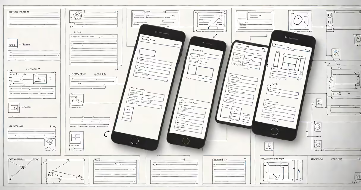
A UX wireframe is a simplified, static representation of a digital product's interface that focuses on layout, content hierarchy, and user interaction flow without visual design elements like color, typography, or imagery. It serves as a structural blueprint during early design phases, allowing teams to test usability and functionality before investing in high-fidelity visuals.
Wireframes are typically created using tools like Figma, Sketch, or Adobe XD, but they can also be hand-drawn on paper. They prioritize function over form-showing where buttons go, how menus expand, and how users move through screens. A well-made wireframe communicates intent to stakeholders, developers, and designers alike.
According to the Nielsen Norman Group, wireframes reduce ambiguity in design decisions by making layout choices visible early. This prevents costly revisions later in development. For example, a wireframe for a checkout process will show step progression, form fields, and error states-without indicating whether the button is blue or green.
UX wireframes operate as a communication tool between design, engineering, and product teams. They define the spatial relationships between interface components and map out user journeys. Each element-text field, navigation bar, image container-is represented as a placeholder or block, labeled with its intended purpose.
They are not meant to reflect final aesthetics. Instead, they focus on core principles: clarity, consistency, and task efficiency. A wireframe for a weather app might show a header with location, a large temperature display, a list of hourly forecasts, and a settings icon-all in grayscale rectangles with minimal detail.
When used iteratively, wireframes allow rapid testing of different layouts. Designers can compare versions side-by-side to see which arrangement supports faster task completion. Research from the Interaction Design Foundation shows that teams using wireframes early in the process reduce rework by up to 40% compared to those who skip this stage.
Wireframes vary in fidelity and purpose. Low-fidelity wireframes are quick sketches focused on structure and flow. High-fidelity wireframes include more detail-such as actual font sizes, spacing, and interactive states-but still avoid visual design.
| Type | Fidelity Level | Use Case | Example |
|---|---|---|---|
| Low-fidelity | Minimal detail | Brainstorming, initial concept validation | Hand-drawn sketch of a login screen with labeled boxes for email, password, and submit button |
| Mid-fidelity | Structured layout with basic styling | User testing, stakeholder review | Digital version in Figma with consistent spacing, grid alignment, and placeholder text |
| High-fidelity | Close to final look, but no branding | Prototyping, developer handoff | Screen mockup with precise dimensions, hover states, and animation cues |
Low-fidelity wireframes are ideal for early-stage ideation. They're fast to produce and encourage open feedback because they don't suggest a final aesthetic. Mid-fidelity versions help refine interactions and validate assumptions. High-fidelity wireframes bridge the gap between design and development, providing measurable specs for engineers.
Wireframes are standard practice in agile and lean product development cycles. They appear during the discovery phase of a project, often before any code is written. Their primary role is to align team members around a shared understanding of how the product should work.
For example, when redesigning a restaurant reservation system, a team might create wireframes to test whether users can find available times quickly. By observing how participants interact with a clickable wireframe prototype, designers identify friction points-like confusing date selectors or hidden confirmation steps-before building the real interface.
Wireframes also support accessibility planning. A designer can label form fields with proper ARIA roles or ensure sufficient contrast ratios in the wireframe stage, reducing the risk of exclusion later. The WebAIM organization notes that 98% of top websites fail at basic accessibility checks-many of which could have been caught earlier with structured wireframe reviews.
Many people confuse UX wireframes with mockups or prototypes. A wireframe is not a finished design. It lacks visual polish and interactivity. A mockup adds color, fonts, and images but remains static. A prototype simulates user interaction-clicking buttons, going through screens-and may be tested with real users.
Another misconception is that wireframes are only for web designers. In reality, they're used across disciplines: UX researchers use them to plan interview tasks, product managers use them to define feature scope, and developers use them to understand component behavior. A single wireframe can serve multiple purposes depending on context.
One non-obvious fact: wireframes are often more effective when they're slightly imperfect. A rough sketch on paper can spark more creative discussion than a polished digital version. The imperfection signals that the goal is iteration, not perfection. During a workshop at IDEO, teams generated 30% more solutions when using pencil-and-paper wireframes versus digital tools.
Consider a team building a mobile app to track daily workouts. The first step is creating a low-fidelity wireframe of the home screen. The layout includes:
This wireframe uses gray blocks for content areas, labeled "Workout List," "Add Button," and "Nav Bar." No colors, no logos, no images. The team tests it with five users who are asked to complete tasks like "Start a new running session" and "View last week's progress."
Feedback reveals confusion about where to find the history tab. The original wireframe placed it in the bottom nav, but users expected it under a "Progress" section. The team adjusts the layout, creates a new wireframe, and retests. This cycle continues until the flow feels intuitive.
Only after the wireframe passes usability testing does the team move to high-fidelity design. The final version includes branded colors, custom icons, and micro-interactions-but the underlying structure remains unchanged from the original wireframe.
Wireframes are not decorative. They are functional. They exist to clarify intent, reduce miscommunication, and speed up decision-making. When used correctly, they prevent wasted effort and improve outcomes across teams.