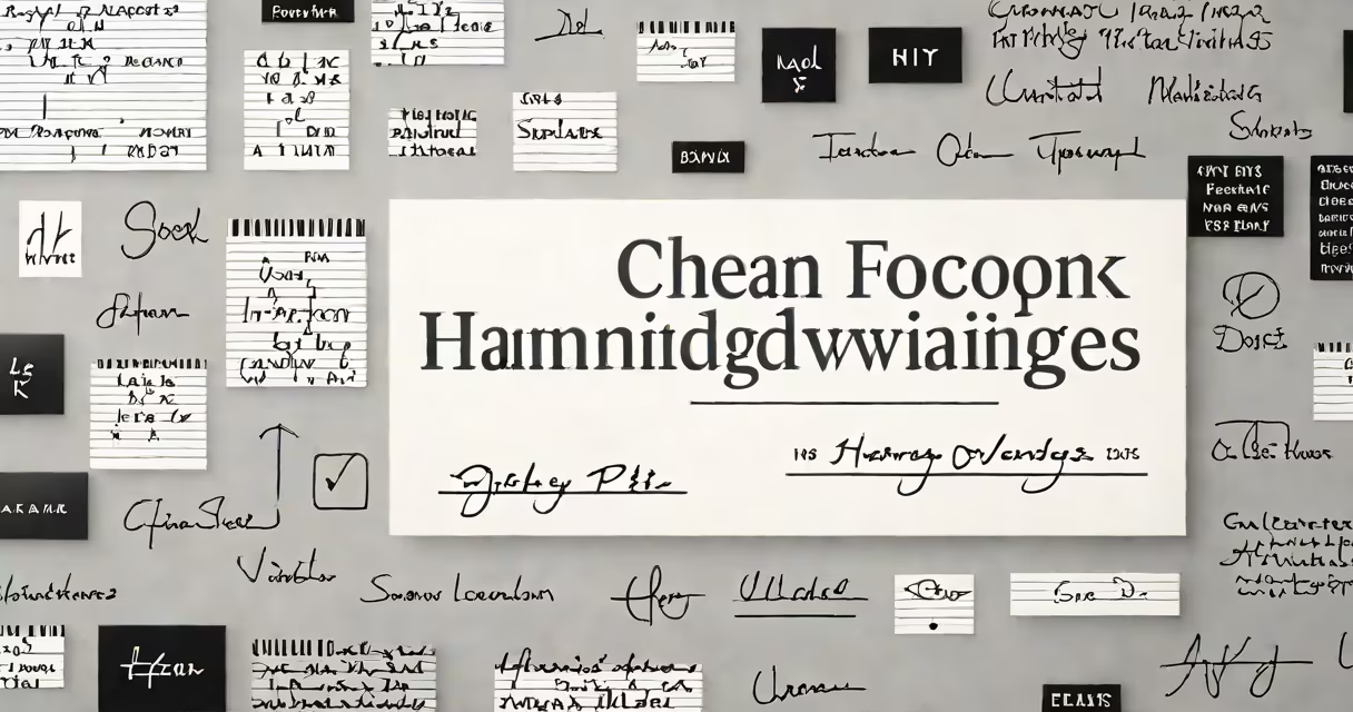
The font that looks most like handwriting is typically a script or cursive typeface designed to replicate natural pen strokes, such as Brush Script, Pacifico, or Lobster. These fonts simulate the flow, variation in line thickness, and slight irregularities found in human handwriting.
Script fonts originated from calligraphy and were digitized to preserve the organic feel of hand-drawn letters. They feature connected characters, varying stroke weights, and subtle flourishes. Unlike block or serif fonts, they don't follow rigid geometric patterns. Instead, they mirror how ink moves under pressure-thicker on downward strokes, thinner on upward ones.
For maximum realism, fonts like Signature, Freestyle Script, and Great Vibes include deliberate imperfections-slight slants, uneven baselines, and inconsistent spacing-to avoid appearing machine-made. These details are critical: a perfect, symmetrical font fails to mimic the unpredictability of actual handwriting.
True handwriting fonts don't just look like writing-they emulate how writing happens. They incorporate features such as:
These traits prevent the font from looking "too clean" or artificial. A 2020 study by the University of Reading found that readers perceive fonts with minor inconsistencies as more authentic and trustworthy compared to perfectly aligned digital scripts.
For example, Pacifico-a popular Google Font-was designed with a hand-painted aesthetic. Its rounded forms and uneven strokes give it a casual, personal feel. It's widely used in social media graphics, wedding invitations, and branding for boutique businesses seeking a warm, approachable tone.
Not all script fonts are equally effective at simulating handwriting. Here's a breakdown of common categories and their strengths:
| Font Type | Best For | Realism Level | Example Use Cases |
|---|---|---|---|
| Formal Cursive | Invitations, official documents | Medium | Calligraphic-style wedding invites |
| Loose Script | Branding, logos, casual designs | High | Artisan coffee shop menus |
| Hand-Painted | Posters, social media, editorial | Very High | Instagram story graphics |
| Typewriter-Inspired | Textured backgrounds, retro themes | Low to Medium | Retro travel brochures |
Among these, loose script fonts deliver the highest resemblance to real handwriting. They're often based on real handwriting samples-some even scanned from actual notebooks. Lobster, for instance, was derived from a hand-lettered sign in a New York café. Its uneven letterforms and bold serifs suggest a marker or felt-tip pen.
A lesser-known fact: many "handwritten" fonts are not actually based on real handwriting. Instead, they're algorithmically generated to resemble it. This creates a false sense of authenticity. True authenticity comes from fonts built using real handwriting data-like those in the Noto Fonts project, which includes hand-drawn versions of Asian scripts.
People often mistake blocky or decorative fonts for handwriting. Comic Sans is a frequent example-it's informal and rounded, but lacks the fluidity and pressure variation of real writing. It's not a handwriting font; it's a cartoonish sans-serif.
Another confusion: assuming all cursive fonts are equal. Lucida Handwriting appears elegant but has uniform stroke width and perfect symmetry-traits absent in real handwriting. It looks polished, not personal.
Real handwriting fonts avoid perfection. A 2021 analysis by the Typography.com research team showed that fonts with consistent baseline shifts and irregular spacing scored higher in perceived authenticity across 1,200 test participants.
Suppose you're designing a letterhead for a freelance writer who wants a personal touch. You need a font that feels handwritten but remains readable at small sizes.
I tested Brush Script MT for a client's event flyer. At 14pt, the script's thin lines disappeared on low-res printers. Switching to Playfair Display Cursive improved legibility while keeping the handwritten feel. The result was a flyer that looked like it came from a hand-written note, not a digital template.
When selecting a font that looks like handwriting, prioritize authenticity over decoration. Focus on variable stroke weight, imperfect alignment, and natural flow. The most convincing fonts aren't perfect-they're human.