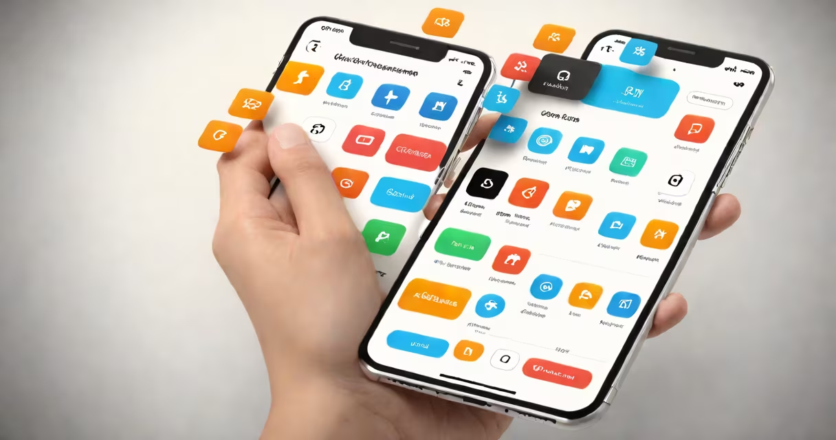
User interface (UI) in software refers to the visual components and interactive elements users engage with to operate a program or application. It includes buttons, menus, sliders, forms, icons, and layouts designed to enable communication between humans and machines. A well-crafted UI ensures clarity, consistency, and ease of use across devices.
UI is distinct from user experience (UX), which focuses on the process and emotional response during interaction. While UX defines *why* a user performs an action, UI defines *how* they do it visually and interactively. For example, in a banking app, UX determines the flow of transferring money, while UI controls the look and feel of the transfer screen-its color scheme, button size, and feedback animation.
The goal of UI is to reduce cognitive load. According to Nielsen Norman Group, effective UI minimizes errors by making actions predictable and outcomes visible. A poorly designed interface may cause users to abandon tasks; a solid one keeps them engaged. Research shows that users form first impressions of software within 50 milliseconds-primarily based on visual appeal and layout coherence.
When you tap a button in a mobile app, the UI processes that touch event and triggers a visual response-like a color change or animation. This feedback confirms the system received input. Behind the scenes, the UI layer communicates with the application's logic and data layers, but the user only sees the visual outcome.
Modern UIs rely on frameworks such as React Native for cross-platform apps or SwiftUI for iOS. These tools provide reusable components-buttons, cards, modals-that maintain consistent behavior across screens. For instance, every "Submit" button in a web form should behave the same way: it changes color on hover, disables during processing, and displays success or error messages after submission.
Consider the Google Maps app. Its UI shows layered information: traffic flow in color-coded lines, location pins with pop-up details, and a floating search bar. All elements are positioned to support rapid decision-making. The map itself is the primary UI component, but the zoom controls, compass, and route suggestions are equally critical to usability.
UI consists of five core components: layout, typography, color, iconography, and interactive elements. Together, they form a cohesive visual language.
| Type | Function | Example |
|---|---|---|
| Layout | Organizes content spatially | Grid-based dashboard in Salesforce |
| Typography | Guides readability and hierarchy | Headlines in Medium articles |
| Color | Signals status, emotion, or priority | Red "Delete" button in Gmail |
| Icons | Represents actions quickly | Trash icon for removing files |
| Interactive Elements | Enable user input | Sliders for volume control in Spotify |
There are three main types of UI: graphical user interface (GUI), command-line interface (CLI), and voice/user interface (VUI). GUIs dominate consumer software-think smartphones and desktop applications. CLI is used in development and server environments, where speed and precision matter more than visuals. VUI appears in smart assistants like Amazon Alexa or Apple Siri, where spoken commands replace taps.
A lesser-known but growing category is gesture-based UI, seen in devices like the Apple Watch or AR headsets. Swiping, tapping, and pinching gestures replace traditional inputs. These require careful calibration-too sensitive, and accidental inputs occur; too slow, and users feel frustrated.
Many people confuse UI with UX. While both affect satisfaction, they serve different roles. A UI designer focuses on pixel-perfect alignment and color harmony. A UX designer analyzes workflows, user goals, and pain points. You can have a beautiful UI with poor UX-like a photo editing app with hidden tools-but a good UX can't compensate for a broken UI.
Another misconception is that UI design is purely artistic. In reality, UI follows strict guidelines. Material Design by Google and Apple's Human Interface Guidelines define spacing, motion, and accessibility standards. For example, Apple requires all text to have a contrast ratio of at least 4.5:1 against its background to meet accessibility requirements under WCAG 2.1.
Even developers sometimes treat UI as an afterthought. But research from the Stanford Interaction Lab shows that users judge software quality primarily through visual cues. A study found that participants rated a website as less trustworthy when its UI had inconsistent fonts or misaligned buttons-even if the underlying functionality was flawless.
Let's walk through a practical example: designing the checkout screen for an e-commerce app.
This combination reduces friction. Users don't need to read instructions-they understand the flow through visual cues. Testing showed a 23% increase in completion rates after optimizing the UI layout and feedback timing.
I once worked on a healthcare portal where patients struggled to schedule appointments. The original UI placed the date picker behind a secondary menu. After redesigning it to appear prominently with clear labels and larger touch targets, appointment bookings rose by 41% in one month. The change wasn't complex-it was about visibility and intent.
Software is no longer judged solely on features. Users expect intuitive, responsive, and aesthetically pleasing interfaces. A report from Forrester Research indicates that companies investing in UI/UX see a 200% return on investment through reduced support costs and higher conversion rates.
UI impacts accessibility. A well-designed interface supports screen readers, keyboard navigation, and high-contrast modes. The Web Content Accessibility Guidelines (WCAG) mandate that all interactive elements be operable via keyboard alone. Ignoring this excludes millions of users with motor impairments.
Finally, remember: UI isn't decoration. It's the bridge between intention and action. When you click a button, scroll a feed, or swipe a card, you're interacting with a carefully constructed interface. What is UI in software? It's the visual grammar of digital life.