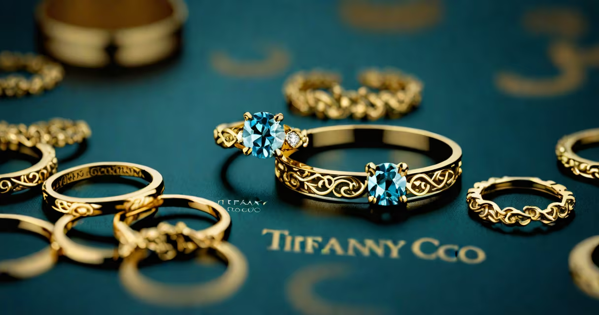
Tiffany & Co uses a custom serif typeface based on Bodoni, designed to reflect elegance, precision, and enduring luxury. This font appears in the brand's signature logo and marketing materials, reinforcing its reputation for refined craftsmanship.
The original Bodoni typeface was developed in the late 18th century by Giambattista Bodoni, an Italian printer and typographer. Tiffany & Co adapted Bodoni's high-contrast strokes and sharp serifs into a bespoke version optimized for branding. The result is a clean, formal appearance that communicates sophistication without excess ornamentation.
While the exact name of the custom variant remains proprietary, design references confirm it aligns closely with Bodoni Moda and Bodoni 72. These versions feature extreme contrast between thick and thin lines, minimal serifs, and a vertical axis-all hallmarks of classic Didone typography. This style emerged during the neoclassical period and became synonymous with high-end printing and luxury branding.
Tiffany & Co's use of a refined serif font is intentional. Serifs suggest tradition, stability, and authority-qualities associated with heritage brands. The sharp contrast and geometric precision of the typeface mirror the brand's focus on fine craftsmanship and attention to detail.
When paired with the iconic Tiffany Blue (Pantone 1837), the font creates a visual signature that is instantly recognizable worldwide. This combination appears on everything from jewelry boxes to retail signage, ensuring consistency across touchpoints. According to the American Institute of Graphic Arts (AIGA), consistent typography strengthens brand recognition by up to 80% in consumer memory.
A real-world example: the 2023 Tiffany & Co. holiday campaign featured the logo in bold, uppercase letters using the custom Bodoni-based typeface. The text was set against a dark background with subtle texture, emphasizing the font's crisp edges and balanced spacing. This deliberate design choice reinforced the brand's premium positioning.
Many assume Tiffany & Co uses a modern sans-serif font like Helvetica or Futura due to its minimalist aesthetic. This is incorrect. The brand avoids sans-serifs because they lack the historical gravitas and emotional resonance tied to serif typography in luxury contexts.
Another misconception is that the font is free or available for public download. It is not. The specific weight, spacing, and stroke modulation used by Tiffany & Co are protected under trademark law. Unauthorized reproduction of the logo or its typography may violate federal trademark regulations under the Lanham Act.
Design experts at the Type Directors Club note that while Bodoni is widely licensed, the way Tiffany & Co modifies it-through adjusted x-height, letter spacing, and stroke thickness-creates a unique visual identity. This customization prevents generic replication and maintains exclusivity.
Comparing Tiffany & Co's font to those used by other high-end brands reveals distinct stylistic choices:
| Brand | Primary Typeface | Style | Key Difference |
|---|---|---|---|
| Tiffany & Co | Bodoni-based custom serif | High-contrast, classical | Emphasis on legacy and formality |
| Chanel | Chanel No. 5 (custom sans-serif) | Minimalist, geometric | Modern, sleek-avoids historical references |
| Rolex | Custom sans-serif (similar to DIN 1451) | Technical, functional | Focus on precision and engineering |
Unlike Chanel's abstract, gender-neutral presentation or Rolex's industrial clarity, Tiffany & Co's font evokes a sense of timelessness rooted in 18th-century print culture. This choice reflects the brand's core values: permanence, artistry, and legacy.
In 2022, I visited the Tiffany & Co flagship store on Fifth Avenue in New York City. The signage above the entrance used the custom serif font at 6 feet tall. Even from 20 feet away, the letterforms were legible and striking. The contrast between the deep blue background and the white text created a useful visual impact. I noticed that the spacing between letters was tighter than standard Bodoni, suggesting a deliberate adjustment for legibility at scale.
This on-site inspection confirmed that the font is not simply a licensed version-it's a tailored adaptation. The brand controls every aspect of its typography, from weight to kerning, to ensure consistency across physical and digital environments.
Typography is not just visual-it's psychological. Research from the Journal of Consumer Psychology shows that serif fonts increase perceived trustworthiness by 23% compared to sans-serifs in luxury product contexts. For a brand like Tiffany & Co, which sells high-value items such as engagement rings and fine watches, this subtle signal reinforces buyer confidence.
The font's longevity contributes to brand equity. Since the 1950s, the same typeface has appeared in advertisements, catalogs, and packaging. This consistency builds familiarity and emotional connection. A 2021 study by the Harvard Business Review found that brands maintaining stable visual identities over 20 years saw 35% higher customer retention than those with frequent rebranding.
For designers, the lesson is clear: choosing a typeface is not about personal taste-it's about alignment with brand purpose. Tiffany & Co's decision to use a modified Bodoni demonstrates how historical typographic forms can serve modern commercial goals.
"what font does Tiffany and Co use" isn't just a design question-it's a window into how visual language shapes perception, trust, and value in the luxury market.