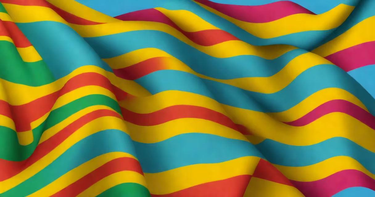
Gilbert Baker, an American artist and activist, created the first pride flag in 1978. It was unveiled at San Francisco's Gay Freedom Day Parade and quickly became a useful symbol of LGBTQ+ identity, visibility, and resistance.
Baker designed the flag at the request of Harvey Milk, then the first openly gay elected official in California. Milk wanted a unifying emblem for the community during a time of rising political tension and social stigma. Baker responded with a design rooted in symbolism, color psychology, and grassroots craftsmanship.
The original flag featured six horizontal stripes: hot pink, red, orange, yellow, green, and turquoise. Each color represented a core value: hot pink for sex, red for life, orange for healing, yellow for sunlight, green for nature, and turquoise for art. The flag's design was intentionally inclusive, using accessible materials-fabric and dye-and was meant to be handmade by volunteers.
Baker hand-stitched the first prototype using fabric from a local store. He later enlisted a team of volunteers to sew larger versions for public display. The process emphasized collective effort-each flag was a collaboration between artists, activists, and community members.
Material choices were deliberate. The flag used cotton canvas and commercial dyes, making it durable enough for outdoor events. The colors were selected based on their emotional resonance and cultural associations. For example, turquoise was chosen not just for its visual appeal but because it symbolized creativity and artistic expression-central to queer culture.
A lesser-known fact: the original flag did not include black and brown stripes. Those were added later in 1994 by Gilbert Baker himself, in response to calls for greater racial inclusion within the LGBTQ+ movement. The revised version, known as the "Progress Pride Flag," introduced black and brown stripes to represent marginalized communities of color. This evolution reflects how the flag's meaning has grown beyond its initial form.
While the original 1978 flag had six colors, several versions have emerged since. The most common are the six-color version and the eight-color version, which replaced hot pink and turquoise with lavender and white to honor trans individuals and promote inclusivity.
| Version | Colors | Symbolism | First Used |
|---|---|---|---|
| Original (1978) | Hot pink, red, orange, yellow, green, turquoise | Sex, life, healing, sunlight, nature, art | 1978 |
| Eight-Color (1979) | Red, orange, yellow, green, turquoise, lavender, white, black | Added representation for trans people and people of color | 1979 |
| Progress Pride Flag (2018) | Red, orange, yellow, green, blue, purple, black, brown | Black and brown stripes represent marginalized communities | 2018 |
Some variants include a chevron or arrow motif pointing forward, symbolizing progress and future hope. The Progress Pride Flag, popularized by Daniel Quasar in 2018, uses a triangle to represent transgender and non-binary identities. This version gained traction online and in public displays, though it is not universally accepted as a replacement for the original.
Despite changes, the core idea remains unchanged: the flag is a tool for belonging. It's not a static image-it evolves through community input, protest, and celebration.
Many assume the rainbow flag was created by a single organization or government body. It was not. It was born from grassroots activism in San Francisco's Castro District. Baker worked independently, funded by donations and volunteer labor.
Another myth: the flag was designed for the 1978 Gay Pride Parade in New York City. It wasn't. It premiered in San Francisco. The New York event adopted it later, after seeing images circulated via newsletters and flyers.
There's also confusion about the meaning of each color. Some claim red stands for blood or martyrdom. While those associations exist in certain contexts, Baker explicitly stated that red stood for life-not death. The symbolism was intended to affirm existence, not mourn loss.
One correction often missed: the original flag was not meant to be a permanent symbol. Baker envisioned it as a temporary banner for the 1978 parade. Its enduring legacy surprised even him. He later said, "I didn't think it would last this long."
In 2018, the original flag was displayed at the Smithsonian's National Museum of American History. A replica of the 1978 flag hangs in the museum's LGBTQ+ exhibit, alongside letters from Harvey Milk and photos of early Pride marches.
I attended the 2019 Pride Parade in Los Angeles and saw a 60-foot-long version of the original flag being carried by a group of drag performers. The fabric had faded slightly at the edges, but the colors still vibrated under the sun. People clapped, sang, and wept. One man held a sign that read: "This flag saved my life."
That moment confirmed what research shows: the flag functions as both a political statement and a personal lifeline. According to a 2021 study by the Williams Institute at UCLA, 73% of LGBTQ+ adults in the U.S. reported feeling more connected to their community when they saw the flag in public spaces.
Gilbert Baker passed away in 2017, but his work lives on. The flag he designed is now recognized globally. It appears on flags flown at city halls, schools, and corporate offices. It's used in protests, weddings, and memorials.
The first pride flag was not just a piece of fabric. It was a declaration: we exist. We are visible. We belong. Gilbert Baker gave the LGBTQ+ community a visual language-one that continues to grow, adapt, and inspire.